Designing Email for the Win
The design of your email has a dramatic impact on how effective it is in achieving your goals. To start with: you need to consider:
- What is your goal for this email?
- What does your recipient want from this email?
Email is a productivity tool, so it is important to be clear and direct about your purpose.
Call to Action
When you email your subscribers, you’re usually looking for a response from them. You may want them to make a purchase, to respond, to share something on social media, or simply to click through to your site. Since email is a productivity tool, your subscribers will want to feel productive when they get your mail, you want to give them something to do or know that confirms that it was worthwhile opening your email. This is your Call to Action (CTA). It needs to be a simple, straightforward request that is impossible to miss.
Often-times your call to action is the point of the mail where you say "click here", "read more", "buy now", or some other instruction. It is important that this CTA is easy to see, impossible to miss, and has a sense of urgency. Your CTA should be short and clear: an effective call to action is generally 2 - 5 words long.
AWeber ran a test on its email newsletter and found that putting the call-to-action in a button was 17% - 33% more effective than putting it in a text-link. However, after 20+ mails with the button, text-links started performing better than the buttons. The key take-out? Calls-to-action need to stand-out, and you should change them occassionally to ensure people notice them more. And, as-always, keep testing. (Source: Aweber)
Testing has shown that it is better to have ONE call to action (CTA) per email rather than multiple calls to action.
Whirlpool found that having ONE Call-To-Action (Treatment) rather than multiple calls-to-action (Control) in an email address led to a 43% average increase in click-throughs (source: Marketing Sherpa)
Placement of the CTA depends on the content of the email. Generally speaking, putting your CTA "above the fold" (i.e. before someone has to scroll to read more) is more effective.
Responsive Email Design
More email is read mobile than on a desktop email client already. According to Litmus Email Analytics, 47% of email is now opened on a mobile device (Litmus, ”Email Analytics”, April 2014).
In fact, email is the most popular activity on US smartphones (Always Connected, IDC & Facebook, 2013) . In South Africa, it is only email as a surpassed by use of chat applications like WhatsApp, Mxit, and BBM.
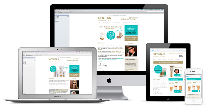
Hence it is important to consider how your mail will appear on mobile. Below is an example of Responsive Email design:
Inside-Out Creative designed an email for their client, Xen-Tan, that changes dimensions to fit the screen it is being viewed on. This is called Responsive Design.
Most decent Email Service Providers (ESPs) will have responsive themes. If you are putting together your own responsive HTML email then you should use a tool like Litmus to give you a preview of how your email will appear on different screens and email clients before you send it.
The only problem with this is that up to 43% of people don't automatically have images displayed in their emails. So it is important that key text isn't put on your images, and that you have ALT text behind images in-case they don't appear. Consider styling your ALT text. This gives you an opportunity to grab your reader’s attention, even if images are disabled.


